How I design
These are the ideas behind how I design my sites and the projects I work on. Most of them came from something I built and later had to rethink, so each section points to the work it came from: the Wisp landing page, the navbar and cursor on this site, the dev notes where I took them apart, and the Substrate launch at the end of the page.
- 71
- 21
- 43
- 4 Oct 2026
How I started learning design
I came to design through engineering. For most of the time I have been building software, design was the part I tried to make acceptable before moving on to what I considered the real work. Over the last year that changed, and I have been learning design deliberately, mostly by building interfaces, comparing them with work I admire, and rebuilding the parts that did not hold up.
Apple is the clearest influence, and Steve Jobs’ view of design in particular. He said that design is how it works, and Apple’s short film Design Is How It Works, which takes its title from that idea, is the video that changed how I thought about my own work. I realised that most of what I had been calling design was decoration, applied after the important decisions about how something behaves had already been made somewhere else.
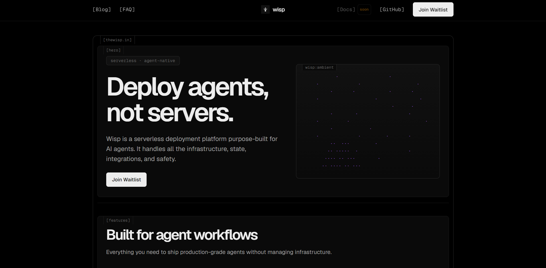
Wisp was the first place I tried to apply that. It was a startup I worked on for deploying AI agents the way developers deploy apps, and although it has since been discontinued, its site still works. I wrote a full design system for it, with bracketed navigation set in Relative Mono, ASCII-drawn diagrams, and a single blue accent, and a large part of this site’s design language still comes from that document.
Looking at the Wisp page now is useful because I would change parts of it. It labels its own sections with tags such as “[Hero]” and “[Features]”, which describe the layout without telling the reader anything. Its feature section opens with “Everything you need to ship production-grade agents”, a sentence that could sit on almost any product page. Neither is a large mistake, but both are the kind of default I now try to catch before shipping, and several of the sections below came from noticing things like them.
Since then I have been experimenting with several interfaces on my own sites: a navbar that behaves like a Dynamic Island, a macOS-style cursor, a daily newspaper assembled from my archive, and the Raster language this page is drawn in. Each experiment taught me something specific, and this page collects those lessons next to the work that produced them.
Leaving perfections for people to notice
There is a sentence I keep returning to when I work: leave perfections for people to notice, instead of leaving loopholes and hoping they miss them. Much of design work is defensive. It checks that nothing is broken, that the layout survives a long title, and that the error message exists. That work is necessary, but it only removes reasons to complain. The other half is deliberately adding something good enough that a careful person might stop and look at it, such as the small circle that separates from my navbar with a green tick when you reach the end of an article.
Very few people notice any single detail like that, and I have had to accept it. What I have seen is that people still register the total. They describe a page as feeling right without being able to say why, and that impression is made of dozens of decisions they never consciously saw. So I do not add details to be recognised for them. I add them because I would know if they were missing.
Walking through my own site as a stranger
After a site has been running for a while, I stop seeing its rough edges. I know which areas are clickable and I excuse the awkward ones because I built them. So I periodically go through the whole site as if I had never seen it, with a written checklist based on Apple’s Human Interface Guidelines that turns vague impressions into specific checks.
The last pass found that the search buttons in my navbar were 32px tap targets, which phones miss regularly, so they now sit inside 44px touch areas. The icon strokes were 1.5px and looked washed out against the dark glass of the navbar, so they went up to 2.2px. Buttons now scale to 95% while pressed, archive cards lost labels that repeated what the card already showed, and going back in the browser now returns you to the same page of results instead of the first one.
A screenshot shows where an animation ends, not how it moves
When I turned my navbar into a Dynamic Island, I had the two reference implementations cloned instead of working from screenshots or memory. A screenshot shows the final position of an animation. It does not show the spring, the 250 millisecond delay before the separating shape sharpens, or the 42 pixels the smaller circle travels as it splits away. Those values decide how the interaction feels, and they are only available in the source code.
Studying a reference this closely makes it easier to take the right part of it. I kept the geometry and timing of the split and left out the phone-call screens, caller photos, and app icons that belonged to the original. The navbar moves like the reference and still looks like my website, which is the line I try to hold whenever I learn from someone else’s work.
Listing what already works before adding anything
Before adding the island, I wrote down everything the navbar already did. It expanded at the top of a page, shrank into a pill after scrolling, opened a drawer on mobile, held the audio player, and drew reading progress around its outline. Each of those behaviours had already been tested, and replacing the navbar wholesale would have meant rebuilding and retesting all of them, so the new states were added around the existing structure.
The same list showed me what to remove. A floating table of contents I built along the way competed with the island for the same space, and it did not survive. Redesigns often go wrong by treating everything old as disposable, and a written list of what already works is the simplest protection I have found against that.
Anything that follows a person constantly has to stay precise
The cursor is an unusual part of an interface. It sits outside the page, but it follows a person through every second they spend on it, so small changes to its movement stay noticeable even when nobody is paying attention to them. When I built a macOS-style cursor for this site, the rule was that it had to behave like a cursor first: pointing, clicking, and selecting text could not become any less precise.
That rule shaped every decision. Movement is smoothed in a way that does not depend on the frame rate, horizontal speed tilts the arrow slightly, and pressing changes its scale, but the I-beam stays upright and still over text because selection needs a stable target. The cursor files I started from contained frames up to 256px, which browsers silently ignore above 128px, so the effect only worked once I extracted frames at a size browsers accept.
Visible effort is evidence of care
When Apple made a new intro for Apple TV, they built it from real glass, practical lighting, and in-camera effects, and then published a video showing how it was made. Rendering it would have been cheaper, and most viewers could not have told the difference on screen. The video mattered anyway, because it showed someone choosing the harder way to do a small thing, and that choice says something about how they will handle larger ones.
AI has made a polished surface almost free to produce, so polish on its own no longer tells anyone much. What still carries information is evidence of specific decisions: a layout that only makes sense for its content, a pattern drawn from real data, and copy that names the actual thing. I check for this by imagining my name and content swapped for someone else’s. If the page would still work unchanged, it contains no decisions yet, and I redesign it.
Judgment is the part I do not hand over
I build much of my software with AI models now. The navbar island was built with GPT 6 Astra in Codex, and the model wrote most of the code. I brought the references, ran each version in the browser, pointed out what felt wrong, and asked for the whole interaction to be checked again after every fix. Most of the design happened in that loop.
I think judgment is the layer that stays human the longest: knowing which reference to study, which constraint matters, when a detail is finished, and when an idea should be removed. The models are fast enough that I can try three directions where I used to try one, which makes choosing between them a larger share of the work.
Software should remember what someone meant to do
If someone spends several minutes setting filters on a dashboard and sends the link to a colleague, the colleague should see the same view. If someone fills out a long form and loses signal as they press submit, their words should still be there when the connection returns. Both failures come from the same mistake, which is treating what a person was doing as temporary memory on one screen.
So I treat the URL as the record of where someone is: filters, pages, and selections live in it, and refreshing or pressing back restores them. Anything a person has typed is kept until it has actually been saved. These are the least visible decisions on any page, and they are the ones people remember most clearly when they go wrong.
Old writing deserves a front page
Most personal sites list writing newest first, which suits news and buries everything else. An essay from two years ago about system design is often as useful as one from yesterday, but in a reverse chronological feed it sits behind pages of pagination that almost nobody opens.
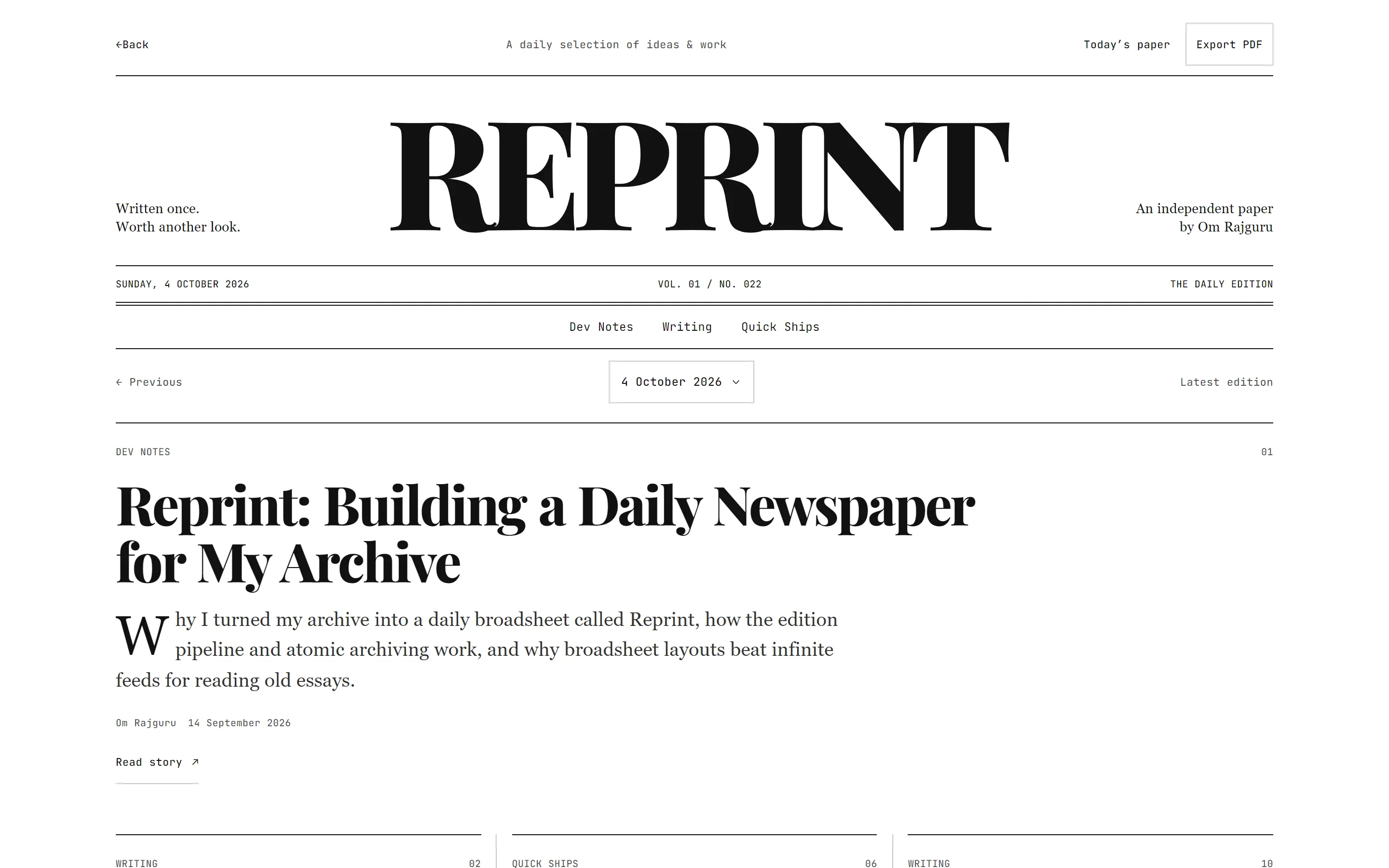
Reprint is my answer to that. Every morning it assembles a twelve-story edition from my essays, dev notes, quick ships, and research notes, and at the end of the day that edition is frozen into a permanent archive. It deliberately uses a different visual language from the rest of the site, a white broadsheet with Playfair Display headlines and Georgia body text, because it is meant to be read like a paper, and the three-column layout uses plain CSS columns with no layout script.
A small palette makes mistakes easy to see
This site uses a black background, text in #ededed, and one accent colour, #1479ff, which I keep for links, focus rings, and the most important element on a page. It uses one type family: Relative Sans for reading and Relative Mono for dates, counts, and code. Spacing is built from a 4px unit, and every border is 1px wide.
With no gradients or illustrations to carry a page, alignment and spacing have nowhere to hide. A heading 3px off the grid, or two sections with slightly different gaps, is visible as soon as the page loads. That makes my own errors easy to find, which is the main reason I keep the palette this small.
Relative, the type family every word here is set in
Relative is my own type family, and every word on this site is set in it. It has three variable fonts: Relative Sans for reading and headings, Relative Rounded for softer interface and branding moments, and Relative Mono for code, dates, and counts. Each has a single weight axis, from 200 to 800 in Sans, 200 to 1000 in Rounded, and 100 to 800 in Mono, so a page can use the exact weight it needs.
Body text on this site is set at weight 460, between Regular and Medium, which only a variable axis allows. Relative Mono gives zero a slash and draws 1, l, and I differently, because code and order numbers are exactly where a misread character causes a real mistake.
Why Raster textures are generated from real data
Raster is the extension this page is drawn in. It takes something continuous, such as a letterform, an image, or a series of numbers, and draws it through dots, squares, or horizontal lines. Each of my sites has its own primitive: dots for writing, squares for projects, and lines for research. Raster never touches body text, buttons, or forms, and the type is set in Geist Pixel, which ships each primitive as a real font, so the words stay selectable and readable by screen readers.
The rule I hold Raster to is that every pattern comes from something real. The dot grid at the top of this page is my publishing record for the last 52 weeks, with one dot for each piece. The halftone behind each mockup is generated from the pixels of that mockup, or of a recording’s still frame. The number beside these sections is redrawn in each section’s primitive when you reach it. A random texture would look identical on another website, while these change when my archive or the work changes.
Designing for people who will never read this page
Almost nobody who uses my sites will read any of this, and they should not need to. Each screen has one obvious primary action and no technical terms, so someone with no technical background can use it without help. When something needs complex logic, the logic stays in the code, and the person sees only the choices they need to make.
Accessibility follows from the same idea. Touch targets are at least 44 by 44 pixels even when the icon is smaller, text meets a 4.5:1 contrast ratio, every control works from a keyboard, and every animation has a reduced-motion version. A detail that only works for people with a mouse and good eyesight is a loophole, in the sense of the first section on this page.
Patterns I leave out
These patterns are common on websites, and none of them appear on mine:
- Gradient text, glowing borders, and blurred colour shapes behind content
- Pill badges with a pulsing dot
- Uppercase labels above section headings
- Rows of three cards, each with an icon in a tinted square
- Sections that fade in every time they scroll into view
- Numbers that count up from zero when a page loads
- Statistics without a date or a source
- Background textures that are not generated from anything
Each of these appears on so many websites that it no longer says anything about the page it is on, which is the opposite of what I want a design decision to do.
Substrate: landing page and launch series
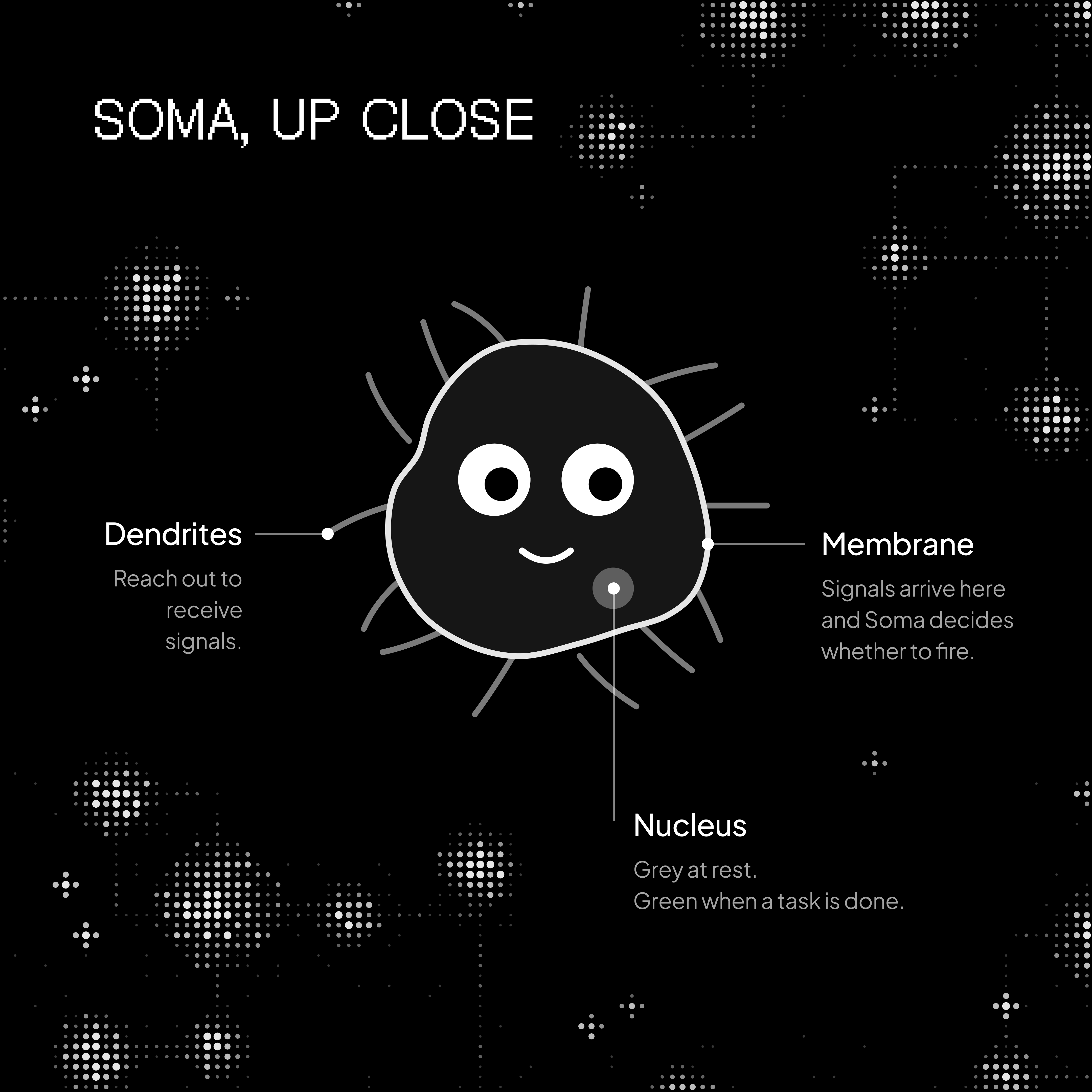
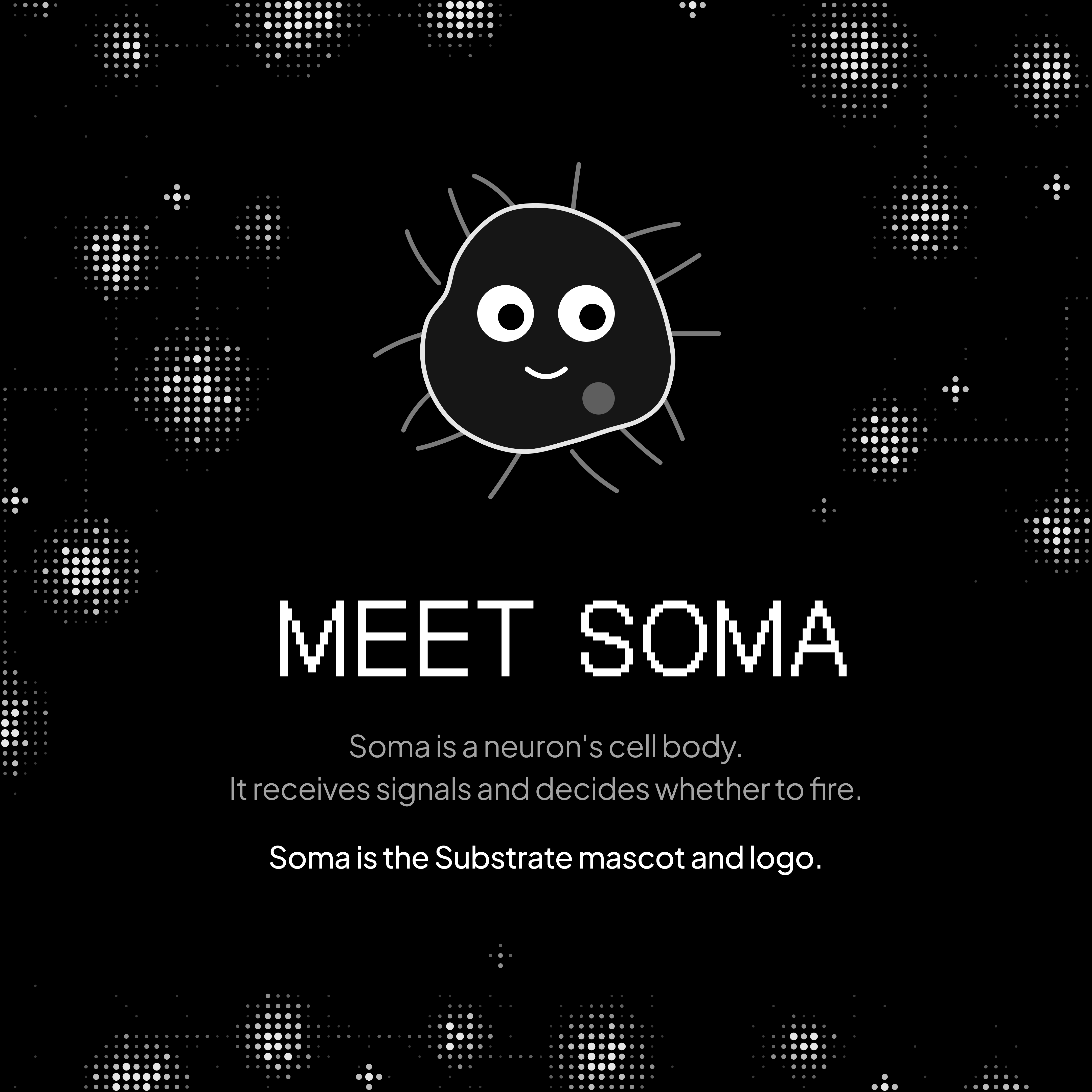
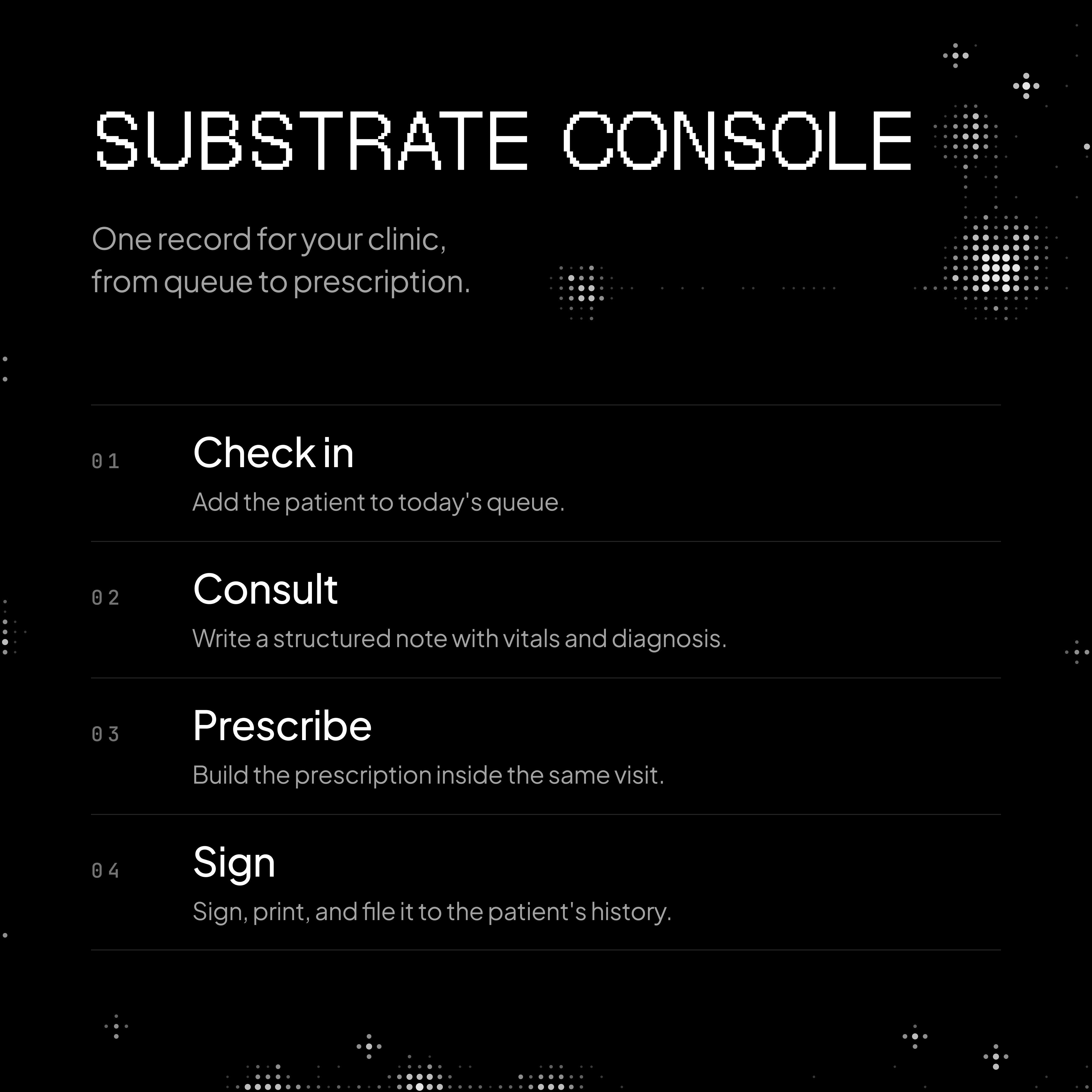
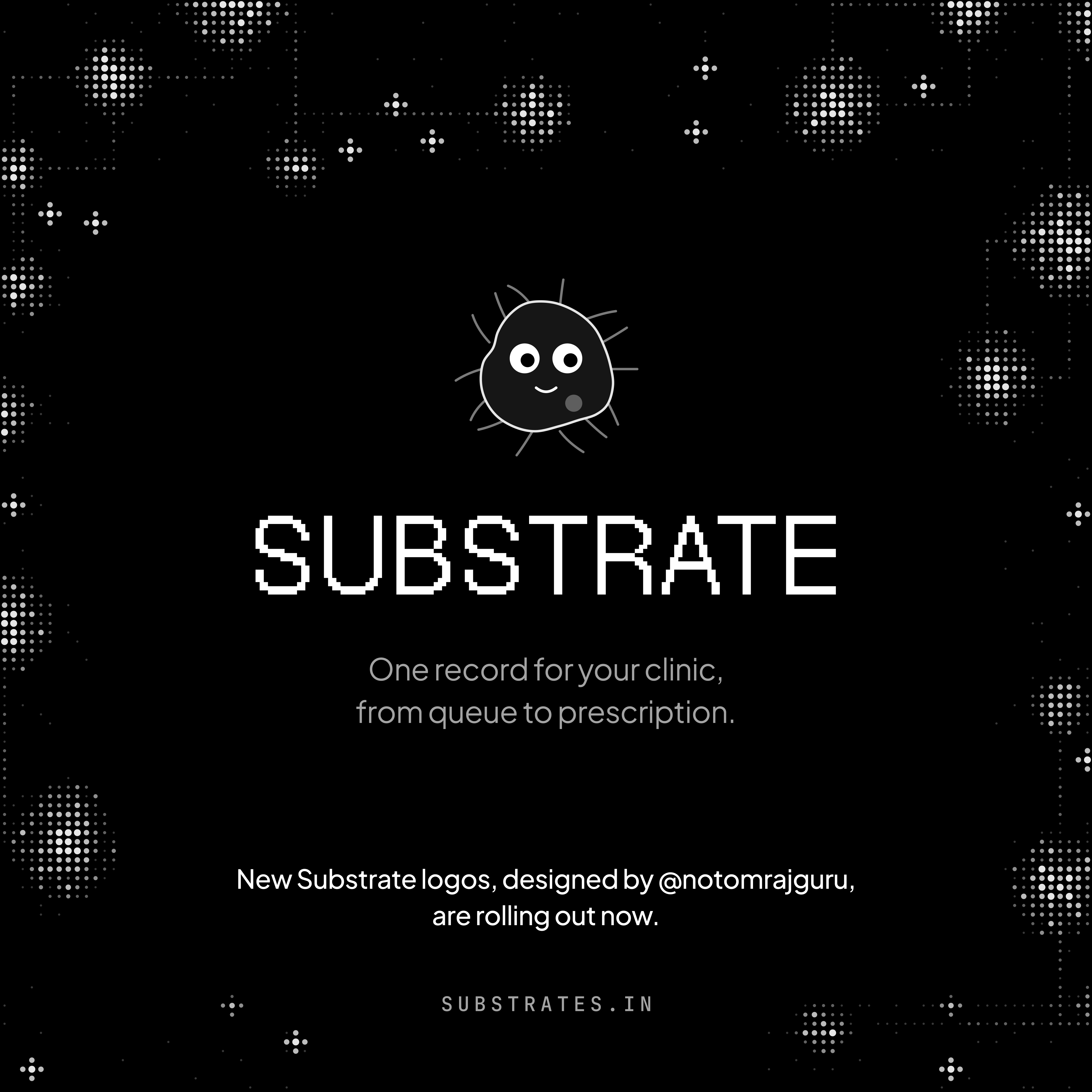
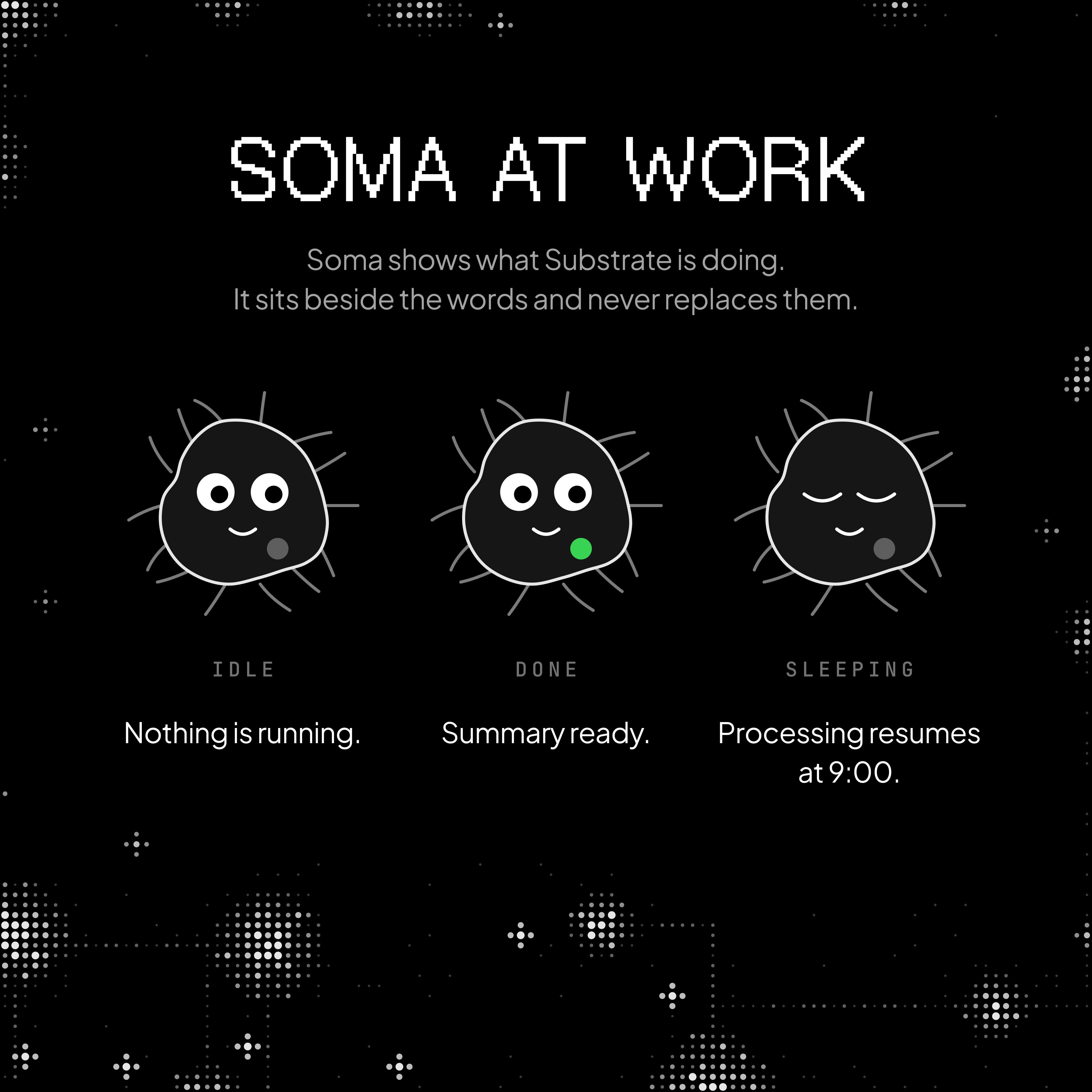
I designed the landing page and a six-post Instagram series for the launch of Substrate. Its first product, Substrate Console, keeps one record for a clinic, from the patient queue to the prescription. Soma is the name for the AI agents planned to work from that record, and it is also the mascot and the logo. Four of the six posts appear earlier on this page next to the principle each one shows; the landing page and the last post are below.
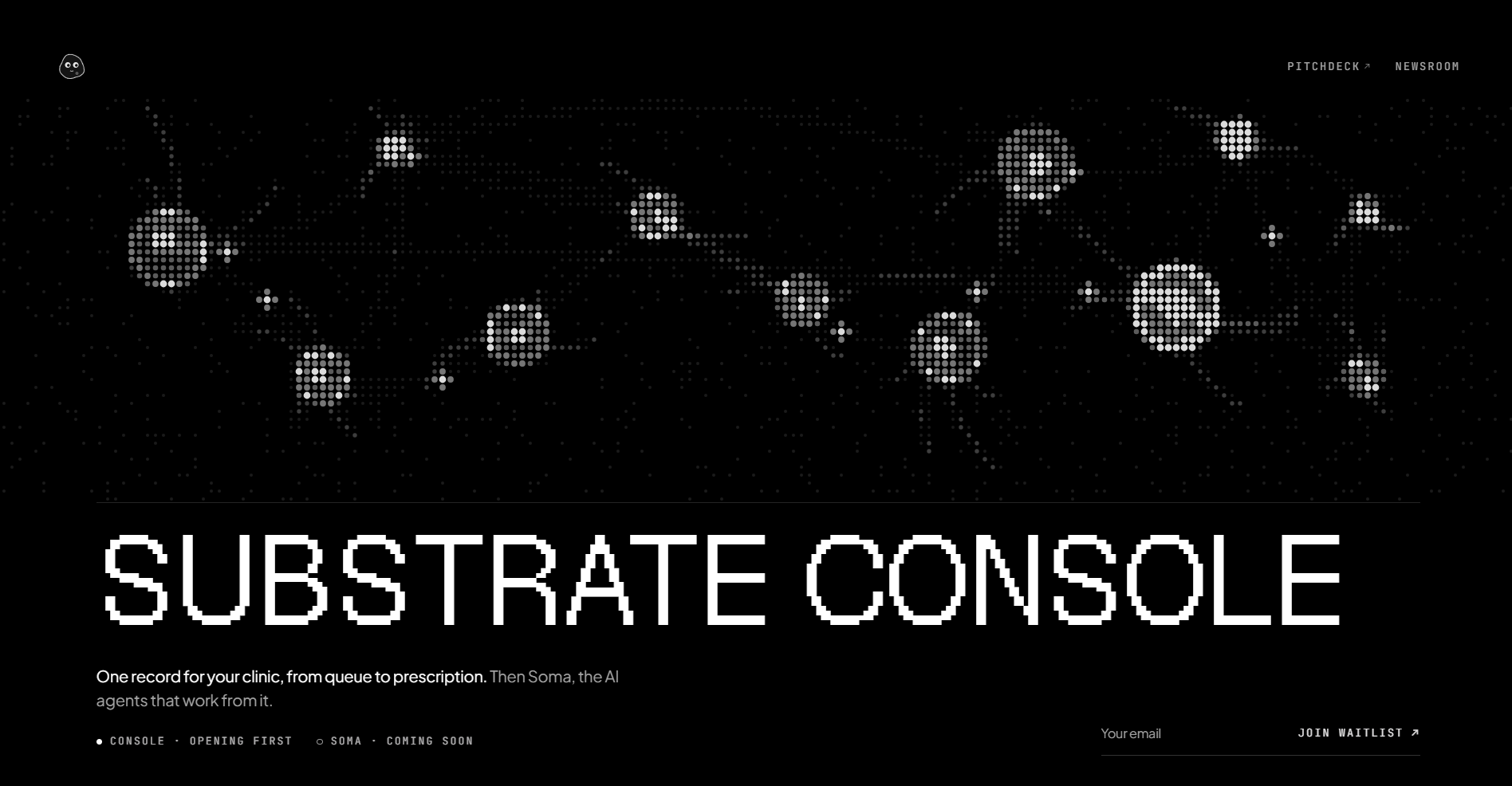
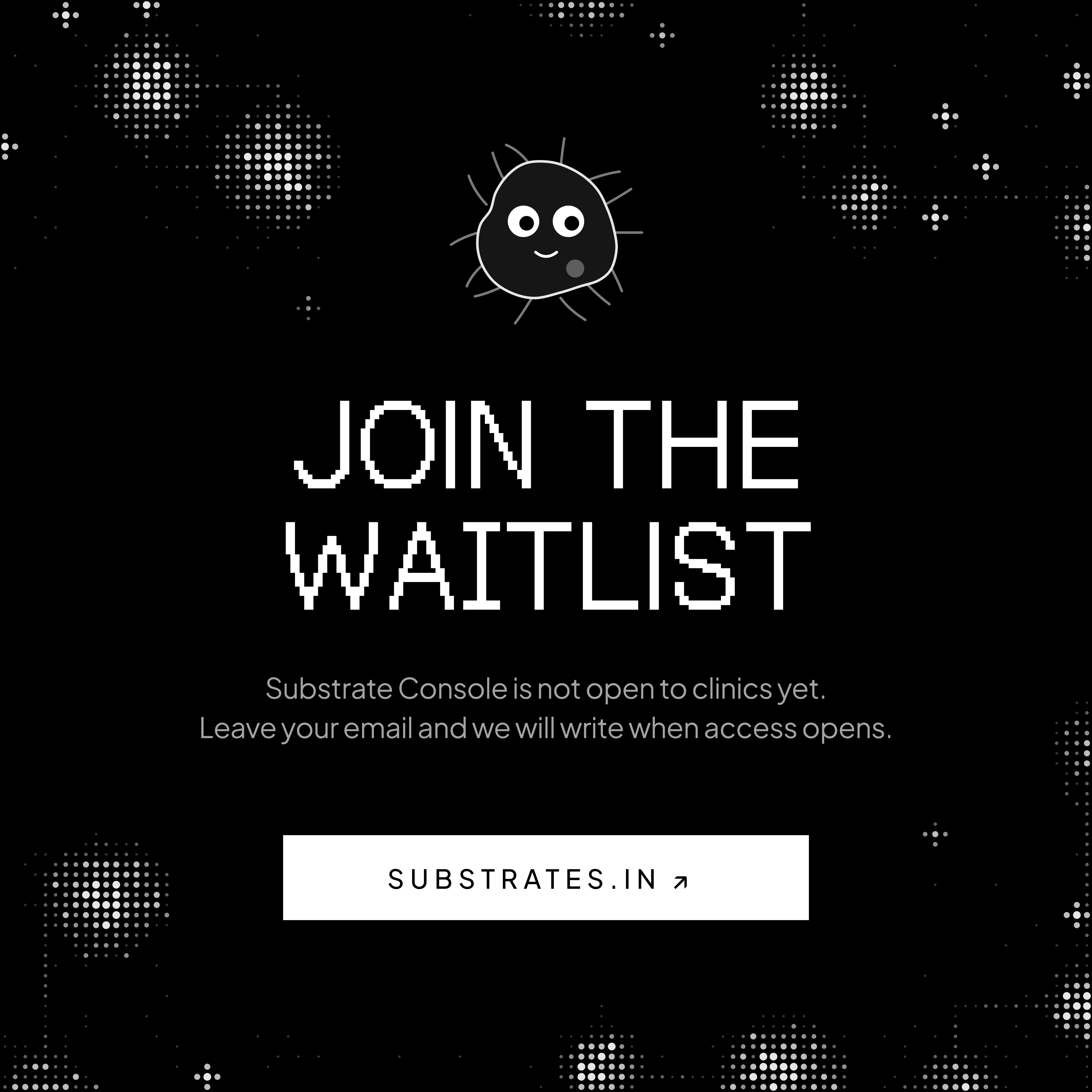
The spheres above the name are drawn from dots and joined by thin lines, which suggests cells and signals without showing anything medical directly. I left out crosses, stethoscopes, and photographs of doctors because health products use them so often that they all look alike at the size of a thumbnail, and the dots and pixel type keep Substrate recognisable at that size.
The posts are a sequence meant to be read in order on a profile grid: the name, the mascot, how the mascot works, its states, the product, and the waitlist. Each post has one heading in the pixel typeface and at most two lines of supporting text, because most people give a post a few seconds before scrolling on.
Soma’s states were the decision that mattered most. A mascot that changes expression is easy to like and easy to misread, so every state is tied to a sentence that says the same thing in words. The mascot makes the status quicker to recognise for people who know it, and the sentence keeps it readable for everyone else.
What comes next
This page will change as I learn. Raster and the Substrate work are the newest parts of it, and I expect at least one idea here to turn out wrong once I have used it on more projects. When that happens, I will rewrite the section and say what changed, so the reasoning behind the change stays on the page.
Most of the work behind these ideas is written up in more detail elsewhere. The dev notes cover how each interface was built, the writings cover why I care about the things I do, and the projects site shows the finished work.